Monday, May 27, 2013

Insomniac

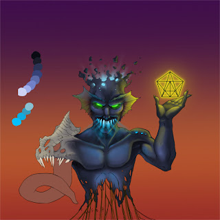
My first client of the year was a great friend, Matthew Coffey. He had requested of me a cover for his first album, Insomniac. He had a particular idea in mind, and we worked together over several days to flesh out what he wanted. In the end, this is what we came up with!


It was a lot of fun working on this project, as Matt gave me a lot of room to play around. The initial sketches looked quite different from the final product!

Please take a moment to give a listen to the incredible creativity and talent in Matt's first album Insomniac


First step: Initial sketch. We had the idea of the Man picking a piece of his exploding head, but Matt felt it would be better to have him not acknowledge his head at all. We changed it a little more, as he wanted the Man to look more Alien...


 After moving the hand, and having the idea of the heads' glow illuminating the title behind him, we started to make him look less human. I was pulling out all the stops I could, adding ideas of glow, fins, spikes, tentacles, and even wires! Matt loved it all, so it was a go ahead...


 Establishing a rough outline now, Matt decides he wants the hand to hold a glowing sigil. I start working on my anatomy, and get the basic forms figured out...


Once I move around some of his features so that they are in proper scale, I get on the colouring. I have a palette on the side of  my workspace for easy reference...


Starting to get the reflected sources of light bouncing off his skin, and adding lots of glow. Figuring out what the background will look like...


Almost done the Aliens' body, and getting the template down for the background. Decided upon a skyline of sorts. Matthew worked on the text graphic while I finished the main colouring, adding even more glow, some sub surface light scattering on the skin in front of light...


After all is said and done, this is what we came up with! The process of concept sketch to final product was not a terribly big difference, but it was very fun!

Please feel free to visit Matt's website for his album Insomniac!

Tribute to Davy Jones

As many people know by now, my favorite character of all time is Davy Jones from The Pirates of the Caribbean: Dead Mans Chest and At Worlds End. I even have a movie replica of the Key to his Chest! Since the image I originally posted for this was way back in college, I figured I'd post it again up front. I hadn't changed the image since then, except for flipping it horizontally. 


I have not to this day spent so much time on one single piece of work. Davy Jones took me a cumulative 40+ hours of work. Studying over a dozen screenshots for colour reference, I painted over a sketch I had done. Even after all these years, I am blown away by this. I might even hazard to say I was entranced while painting, absorbed and transfixed to complete the perfect tribute to my favorite character. I still stare in wonder how I had pulled it off, but I had. Sub surface light scattering FTW!


Out of interest to study Davy a little more, I rendered this out in graphite over the course of a couple days. It taught me a lot about using values to show depth. I only hope that I may get so passionate and driven by my own characters that I may be able to render them in such detail. I have too many characters to know where to begin!

This concludes my Tribute to Davy Jones! Many thanks to Bill Nighy for breathing life into this incredible character! No one else would have been able to do him justice!

Up next I have completed an album cover for a great friend!

Expo Posters Part II

Onward to the next set of posters done for the Expo. This batch I think are my top favorites. My exploration with colour deepens, and my designs get better. These three images all have their own stories, so let us not waste any more time!


First up we have the Carrion Runner. This odd bird like creature is a scavenger in the desert. It runs at high speeds from it's predators, and can make some very strange mating calls. I had fun making him, and even more fun playing with colours. The background is a blurred stock photo, so I know backgrounds will be the next on my list of things to work on.


This is the Bondage Bunny. Long ago, I played an online game called Gaia Online. I was one of the first thousand members. Now the game has millions of users, and I no longer play it. This character is a tribute to the avatar I had on that game. The armband colours are also a tribute to a character from an anime called Dragon Ball Z. A great friend and I once were fans of that character, and he had armbands and leg bands of the same colour. This image is sort of my own "Jessica Rabbit", though the two are still very different.


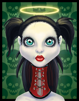
This is the Angel. Carrying on with the BDSM (bondage/dominance, sadism/masochism) theme, I was inspired to paint this image while watching Jennifer Lopez in The Cell, by far one of my top favorite movies. Again I tried to paint without lines, and it turned out really well. Just like the Mona Lisa, this cheeky girl doesn't have eyebrows. To be honest, I couldn't settle on how I wanted them to be expressed, so I omitted them entirely!

I can easily see the jump in progression from the Expo Posters in Part I to Part II. My style is better refined, the colours are better, and the overall images look great. I was very impressed with the progression I had made from just drawing outlines and pencil sketches the year before, to omitting outlines and drawing with colour only!

Next up we have the return of a great character, by far my ultimate favorite character.

Expo Posters Part I

This is the first group of art I had completed for the Expo. On reflection, I had said I wanted to do only original artwork for the Expo. That wasn't the best of ideas. Even though I might have had good intentions, fan art would have turned me the biggest profit. That being said, I will aim for that the next time I get an art table there (I have some TMNT, Green Lantern, and Spiderman fan art already in mind)


First off we have a Shaman Mouse. I loved the movies The Secret of NIMH and The Tale of Despereaux. I've never been terribly fond of anthropomorphic mammals, but they've started to grow on me!


This was my very VERY first work with colour for the Expo. It had been years since I had painted my Tribute to Davy Jones, and without touching a brush for that long, I lost some of my magic. I think that magic is on its way back. A Catalope is what this is.


This picture was my first attempt to paint without outlines. This is my mom's favorite image, but to me it's still not amazing. Once more my ability to render the female form isn't perfect, but it gets better and better. This lady is like a spirit mermaid/ghost form that lives in lakes.
 

The last of the first batch of images was a nifty creature I made that's part woman, part sea dragon. The yellow tang in the corner is maybe my favorite part. This one was one of the first images I made during my time off construction.

My exploration with colour began with these images. I'm getting better with every image, I believe. 

This concludes the first part of my Expo Posters. Up next will be Part II, which I think are even better than the first!


Meet the Bookmarks

One thing I learned at the Calgary Comic Expo was to make things small and affordable. I made four bookmarks for the Expo, which were decently popular, but Pins seemed to be the in thing this time around (what with the introduction of eReaders, bookmarks seemed a little old). I do not regret making them, even if books are not as common, it was still very cool to work with a different canvas shape.


First up was a nifty contrast between the ocean surface and the deep sea. I enjoy the concept of bio-luminescence, especially in a place void of light.
 

Next up is yet another little dragon. I also very much love the insect kingdom, so I wanted to show a mix of my imagination and reality. I like the choice in colours.

I once used to draw a lot of anime inspired work when I was much younger, and even though I have been trying to push it away (many folks in the gaming and comic community do not look highly upon those too inclined to Japanese style artwork). I still believe there can be a lot taken from anime and expanded upon. This bookmark and the next are two of my more "cell shaded" styles.This one was a sort of mermaid.


A little Sylph for between the pages. I would like to redo this one with better wings, but everything else I like about it.

These bookmarks are some of the first pieces of work I had done in full colour. I had always been afraid of colour (perhaps not colour in and of itself, but of my limited experience with it) so it took a lot of effort to make the leap from outlines to colour. I think I made the jump more gracefully than I had expected.

This concludes the bookmark section of my artwork. Next up we'll have some of my full page pictures that I had made for the Expo (as well as a return by someone that I very much love...)

Stay tuned!

Some Oldies, But Goodies

Let's start this process with a quick look back on some of my older artwork that I think is worth a mention.

I have always been interested in outlines more than colour. Here are some of my favorite images that are strictly outlines.

This is my rendition of one of those Chinese Dogs that protect entrances.

This is what I called a Draconic Ryder, a creature that travels on lightening.

Continuing my love of dragons, this is an Ancient Lizard, since it has no wings, it cannot be a dragon.

This is a quick study on the female form. I have always had a tough time with female bodies, but I'm always getting better. 

The last two you might have seen on this blog before, but I will post them again, as I very much love the detail and design of these two dragons.

Lexis is his name, a dragon no bigger than a large house cat. I loved drawing him, his details in his skin surfaces and the little poor mouse!

The final dragon, and my favorite, drawn for a very great friend, is Mathias. If he wrapped his wings around, it could encompass a small house! Beware, he does like the taste of human.

So this concludes the first post of my artwork. Next up will be some of my newer work that I had brought with me to the Calgary Comic Expo. Stay tuned!

A long awaited return

I have been away from this blog for a long time, but I think it's high time I post at least some of the work I have completed over the last while.

After attending the Calgary Comic and Entertainment Expo in 2012 as an artist, I was given a lot of feedback and comments on my work. I still have not given up looking for work in my field, but I have definitely decided that I must not stop working to get better.

This is a little difficult in some regard, as my primary means of work currently states that I spend up to 11 hours in a piece of heavy equipment. This leaves very little time to work on my art, let alone anything else. 

This past off season I spend my time working on my jewelry crafting rather than my portfolio, which has brought me some great insight; I am meant to create. My necklaces have become so popular that I will likely set up an etsy account next year to sell my fine jewelry.

That being said, I still have not lost interest in looking for a career in my field of concept and digital artwork. I have, and always will, love creating creatures and characters. It's just unfortunate that, as with every year about this time, I must return to construction to pay the bills.

So without further adieu, I shall post some of my most recent work.